Articles
5 Common Types of Financial Charts for Data Storytelling
- By AFP Staff
- Published: 2/15/2024

Financial charts help you tell the story that the data conveys, ensuring everyone in your audience understands the meaning behind the data.
Charts are particularly helpful when conducting analyses of investment opportunities, conducting peer evaluation, assessing sales across different regions or deconstructing components of a whole. And for those needing to examine data trends over time, charts are great at showcasing patterns.
But with the variety of charts that are out there, how do you choose the most appropriate chart? Below, we’ve compiled a list of some of the most commonly used charts in finance, so you can select the right option to tell your data story effectively.
Bar Chart
A bar chart uses horizontal rectangular bars to present categorical data. The lengths of the bars are proportional to the values that they represent.
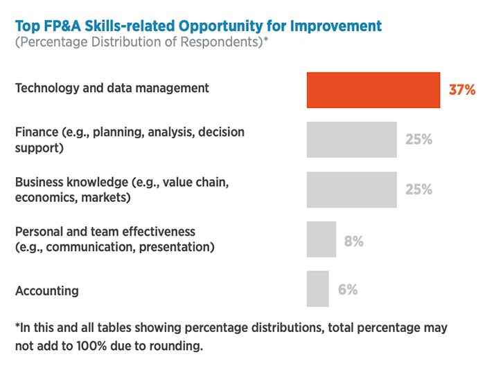 Bar charts are best when dealing with long category titles. Their ability to accommodate extended labels without compromising on clarity makes them ideal for surveys.
Stacked bar charts are best for showing how components contribute to a total, making them handy for displaying percentages in survey responses.
Best Practice: For bar charts, less is more. Anything more than seven bars can get cluttered.
Column Chart
A column chart uses vertical rectangular bars to present categorical data. The heights of the bars are proportional to the values that they represent.
A useful variation of a column chart is a waterfall chart. In the following example of a waterfall chart, the bars display various changes from the beginning position to the end.
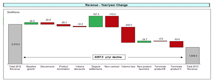
Column charts are best for displaying trends or making relative size comparisons among multiple items. For time series data, column charts are preferred over bar charts because people are accustomed to viewing time on the horizontal axis, making trends easier to understand.
Stacked column charts are best for illustrating how distinct components contribute to an overall total.
Scatter Plot
A scatter plot (also known as a scatter chart) displays values on both the x- and y-axes, allowing for the representation of relationships between two variables.
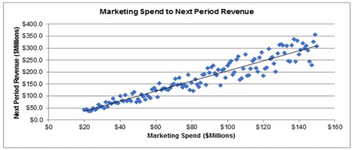 Scatter plots are best for graphically representing large amounts of data points. They also enable the charting tool to create a trendline or regression that summarizes the data in a mathematical way that can be used in models.
Pie Chart
A pie chart uses a circle divided into slices to illustrate numerical proportion. Each slice represents a part of the whole.
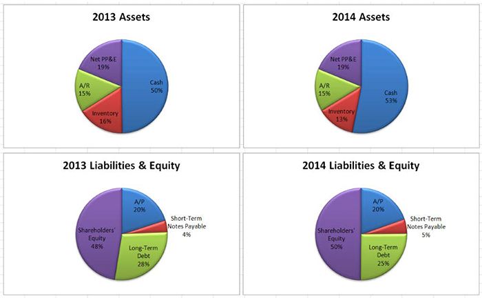 Pie charts are best for illustrating how much individual parts contribute to a whole — for example, breaking down assets or liabilities in a balance sheet. You can use separate pies for each category and emphasize specific slices by exploding or pulling them partly out. When multiple pie charts are shown next to each other, changes over time can be seen.
A word of caution: Too many slices can make the pie chart confusing, so it’s best not to have more than a few slices.
Line Chart
A line chart displays a series of data points connected by straight lines.
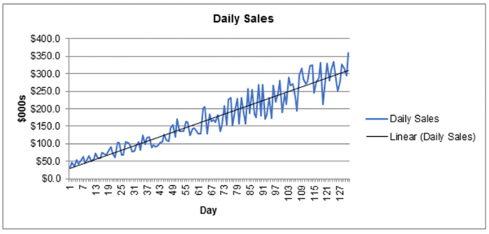 Line charts are best for visualizing trends in continuous data, especially over time. They're great for showing how a variable evolves, with the line connecting data points suggesting a continuous series. Keep in mind that line charts work best when your data follows a natural sequence over time.
How Do I Decide Which Chart to Use?
The chart you should choose is the one that best tells the story of your data. The easiest way to test this out is by clicking through the different chart types to see how they visualize the data — a feature most development tools offer. Always prioritize information value over visual appeal. Even though a 3D chart might look flashier than a line chart, it can also make the information confusing to view. If it doesn’t tell the story well, it doesn’t matter what it looks like.
This applies to the data being presented as well. Adding too many variables to a chart can distract from the message. One method that could prove helpful is the aggregation of data into useful categories before charting it — for example, sorting sales by department rather than by salesperson.
When faced with the choice between two viable alternatives for charts, the selection should be guided by the one that best conveys your intended message and fits your organization’s customary display preferences for specific data.
Financial Chart Best Practices
When creating a financial chart, here are five best practices to follow:
- Use a range for the axis that highlights the area of significance by customizing the minimum and maximum values for the range.
- Shorten labels and legend information to make them easier to read.
- Sort results that are not in a time series (or other specific order) from largest to smallest (or vice versa) so they’re easier to compare.
- If you use colors and shading, ensure that the chart components are easily discernible and the text is clearly legible.
- Carefully consider what ranges to use for unit data. Too few increments make the chart hard to interpret, and too many make it look cluttered.
More Resources to Improve Your Data Visualization Skills
- Painting with Numbers (Self-Paced Course)
Present numbers clearly and effectively so your ideas and your message shine. - Best Practices for Compelling Data Visualizations
Copyright © 2024 Association for Financial Professionals, Inc.
All rights reserved.

